Introduction
Optimizing ads is one of the most intellectually challenging jobs as a data scientist can do. It is a complex problem given a huge size of the observations as well as number of features that can be used. The goal of this project is to take a look at several ad campaigns and analyze the performance and predict the future performance.
Challenge Description
company XYZ is a food delivery company, in order to get customers, they rely significantly on online ads, such as Google or Facebook. At the moment, they are running 40 ad campaigns and want you to help them understand their performance.
There are specifically three challenges:
- If you had to identify the 5 best ad groups, which ones would they be? Which metric did you choose to identify the best ad groups? Why? Explain the pros of your metric as well as the possible cons.
- For each group, predict how many ads will be shown on Dec, 15 (assume each ad group keeps following its trend).
- Cluster ads into 3 groups: the ones whose avg_cost_per_click is going up, the ones whose avg_cost_per_click is flat and the ones whose avg_cost_per_click is going down.
Data Schema
- Date: all data are aggregated by date
- shown : the number of ads shown on a given day all over the web. Impressions are free. That is, companies pay only if a user clicks on the ad, not to show
- clicked : the number of clicks on the ads. This is what companies pay for. By clicking on the ad, the user is brought to the site
- converted : the number of conversions on the site coming from ads. To be counted, a conversion has to happen on the same day as the ad click.
- avg_cost_per_click : on an average, how much it cost each of those clicks
- total_revenue : how much revenue came from the conversions
- ad : we have several different ad groups. This shows which ad group we are considering
Challenge1
since I want to identify the top 5 best ad group. There are several metrics can be used:
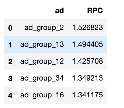
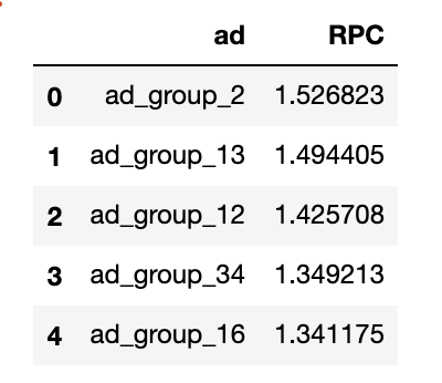
- average revenue per click(RPC) per group, calculated as (total revenue) / (total clicks)
- click through rate(CTR) per group, calculated as (how many time an ad is clicked)/ (how many time an ad is showned)
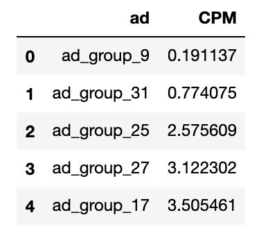
- cost per thousand views (CPM) per group, calculated as (total cost of an ad) / (number of impressions)* 1000
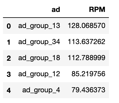
- revenue per 1000 ad impressions(RPM) per group, (total revenue of an ad) / (number of impressions)* 1000
CTR
- pros: it measures how effective an ad is able to drive the traffic to the site.
- cons: it doesn’t show any revenue. if the visitor is just visiting the site and we are not able to convert them into customer, the ads are not good.
CPM
- pros: if we want to maximize the ad profit, we need to minimize the cost of each ads and it gives us a direct metrics to measure the cost of an ads
- cons: having low cost per impression is not necessary good if the channel has low CTR which means there are not any user engagement, we may think not to even put an ad at such channel
RPM
- pros: direct measurement of revenue per impression. we want to maximize this metrics
- cons: did not reflect any cost issue. if a channel drives high revenue per impression but it also has high cost per impression, which means we are still not making any profit. it may not be a good ad channel that we want to use
RPC
- pros: it is effective metrics to set to hit revenue based goal and it can be used to calculate cost per click
- cons: if you have high cost per click (cpc) it may not be a good idea, since you may loose money on this ad
Top 5 ad groups with highest CTR
Top 5 ad groups with smallest CPM
Top 5 ad groups with largest RPM
Top 5 ad groups with largest RPC
Challenge 2
In order to predict the number of impressions on a specific day, I first need to understand the historical impression performance of each ad group.
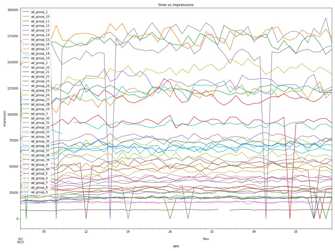
from the above image, each different ad groups has different temporal orders. Let’s try to understand the patterns of ad_group_1.
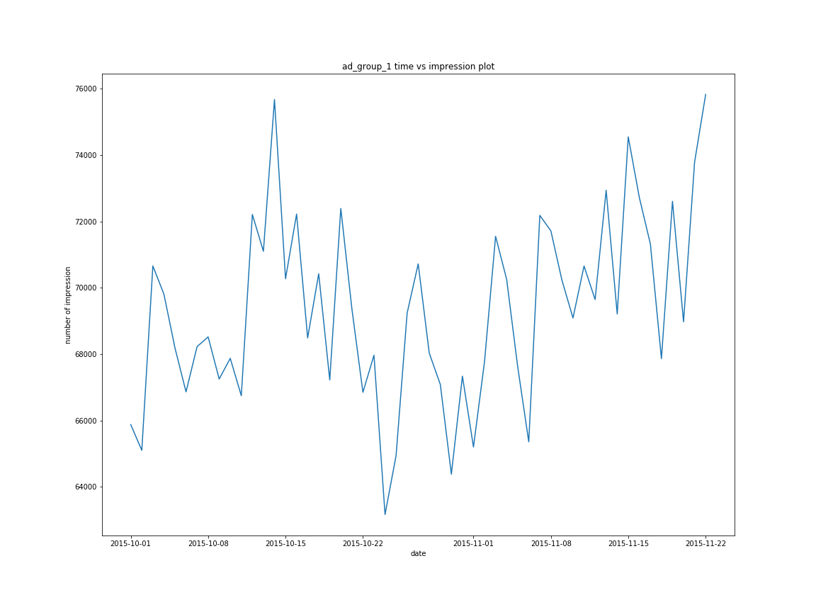
There are several peaks in the pattern. However, we need to further test the stationarity of ad_group_1 impressions. In addition, visualizing the mean impression over time and standard deviation over time is impreative to ensure that our time series data is not a white noise process.
white noise process
what is white noise process?
a white noise process means that a time series is white noise if the variables are independent and identically distributed with a mean of zero.
This also means that the time series has constant variance and each value has zero correlation with other values in time series.
why does it matter?
- if the time series is white noise, then it is random and you can’t model it to make prediction
- the error from a time series should ideally be white noise
when forecast errors are white noise it means that all of the signal information in the time series has been used by the model. All that is left is the random fluctuations that can’t be modeled.
a sign that model predictions are not white noise is an indication that further improvements to forecast model maybe possible.
Check Stationarity
def test_stationarity(timeseries):
    #determine rolling statistics, make sure the time series is not white noise
    rolmean = timeseries.rolling(3).mean()
    rolstd = timeseries.rolling(3).std()
    #plot rolling statistics
    fig , ax = plt.subplots(figsize = (10,8))
    original = ax.plot(timeseries,color='blue',label='original')
    mean = ax.plot(rolmean,color='red',label='rolling_mean')
    std = ax.plot(rolstd,color='black',label='rolling_std')
    ax.legend(loc='best')
    ax.set_title('original vs rolling_mean vs rolling_std')
    plt.savefig('original_vs_rolling_mean_vs_rolling_std')

    #perform dicky-fuller test:
    print("perform dicky fuller test: ")
    dftest = adfuller(timeseries,autolag='AIC')

    dfoutput = pd.Series(dftest[0:4], index=['Test Statistic','p-value','#Lags	Used','Number of Observations Used'])
    for key,value in dftest[4].items():
        dfoutput['Critical Value (%s)'%key] = value
    print(dfoutput)
test_stationarity(ad_group)
after running the above program, I have the following visualization and test result.
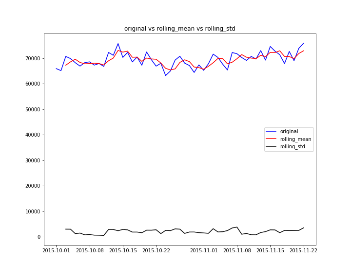
from the plot, I am able to notice
- the mean impression over time is not 0
- the standard deviation over time is relatively constant
- the correlation among different time is not 0
The Augmented-Dicky-Fuller test is a type of statistical test called a unit root test. The intuition behind a unit root test is that it determines how strongly a time series is defined by a trend. There are several unit roots tests. Augemented-Dicky-Fuller test is a more widely used test. It uses an autoregressive model and optimizes an information criterion across multiple different lag values.
- Null Hypothesis: time series has a unit root, time series is non-stationary
- Alternative Hypothesis: time series doesn’t have a unit root, time series is stationary.
We interpret the result using p-value from the test. A p-value below the threshold(0.05 in this case) suggest we reject the null hypothesis, otherwise we fail to reject the null hypothesis.
- My test result shows that the p-value is less than 0.05, i can reject the null hypothesis, conclude that the time series data is stationary
ACF and PACF Plot
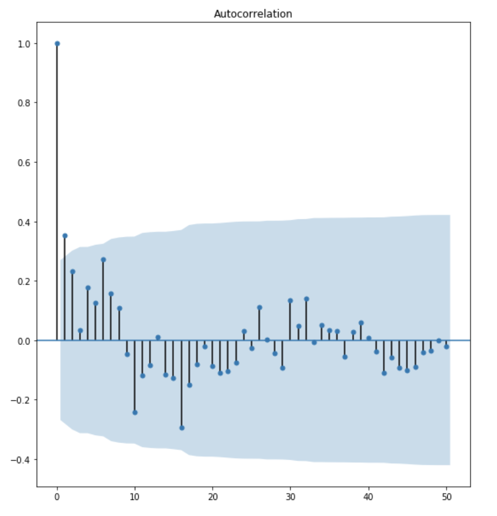
from the ACF plot, I observe that lag 1 is quite significangt since it is well above the confidence interval band. lag 2 is significant as well. However, I am going to be conservative and choose the p term to be 1.
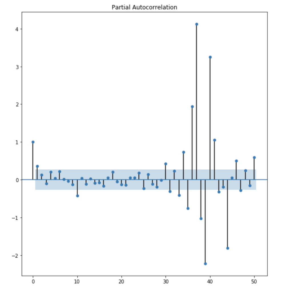
from the PACF plot, I observe that lag 1 and lag 2 are both significant. However, to be conservative, I choose the q term to be 1.
AR model
# import packages
from statsmodels.tsa.arima_model import ARIMA
from statsmodels.tools.eval_measures import aicc

results_AR = model.fit(disp=0)
print(results_AR.summary())
fig, axes = plt.subplots(2,1,figsize=(15,10))
axes[0].plot(ad_group)
axes[0].plot(results_AR.fittedvalues, color='red')
residuals = pd.DataFrame(results_AR.resid)
residuals.plot(kind='kde',ax=axes[1])
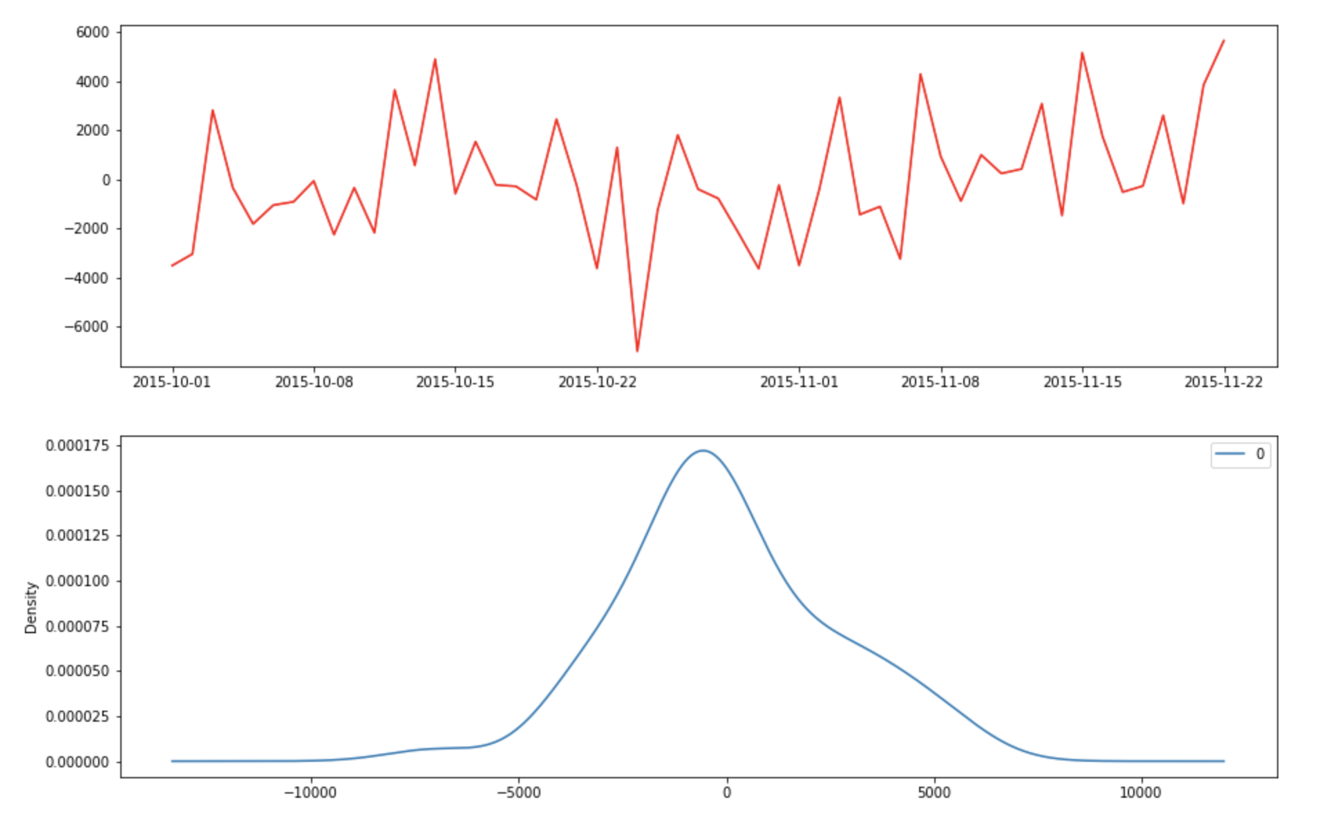
After running the above program, we would like to check the fitted value vs the actual value

The result looks decent, Let’s check the residual error and make sure it is a white noise process.
MA model
model = ARIMA(ad_group['shown'],order=(0,0,1))
results_MA = model.fit(disp=0)
print(results_MA.summary())
fig, axes = plt.subplots(2,1,figsize=(15,10))
axes[0].plot(ad_group)
axes[0].plot(results_MA.fittedvalues, color='red')
residuals = pd.DataFrame(results_MA.resid)
residuals.plot(kind='kde',ax=axes[1])
Let’s check the fitted value vs true value and the residual error to make sure they are white noise.
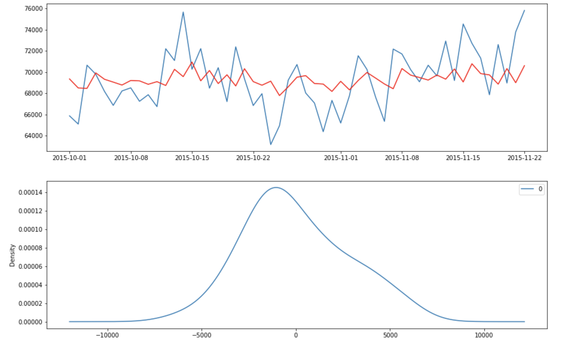
The error appears to have a zero mean and follows a gaussian distribution.
ARMA model
model = ARIMA(ad_group['shown'],order=(1,0,2))
final_ARMA = model.fit(disp=0)
print(final_ARMA.summary())
fig, axes = plt.subplots(2,1,figsize=(15,10))
axes[0].plot(ad_group)
axes[0].plot(final_ARMA.fittedvalues, color='red')
residuals = pd.DataFrame(final_ARMA.resid)
residuals.plot(kind='kde',ax=axes[1])
Let’s check the fitted value and the residual errors
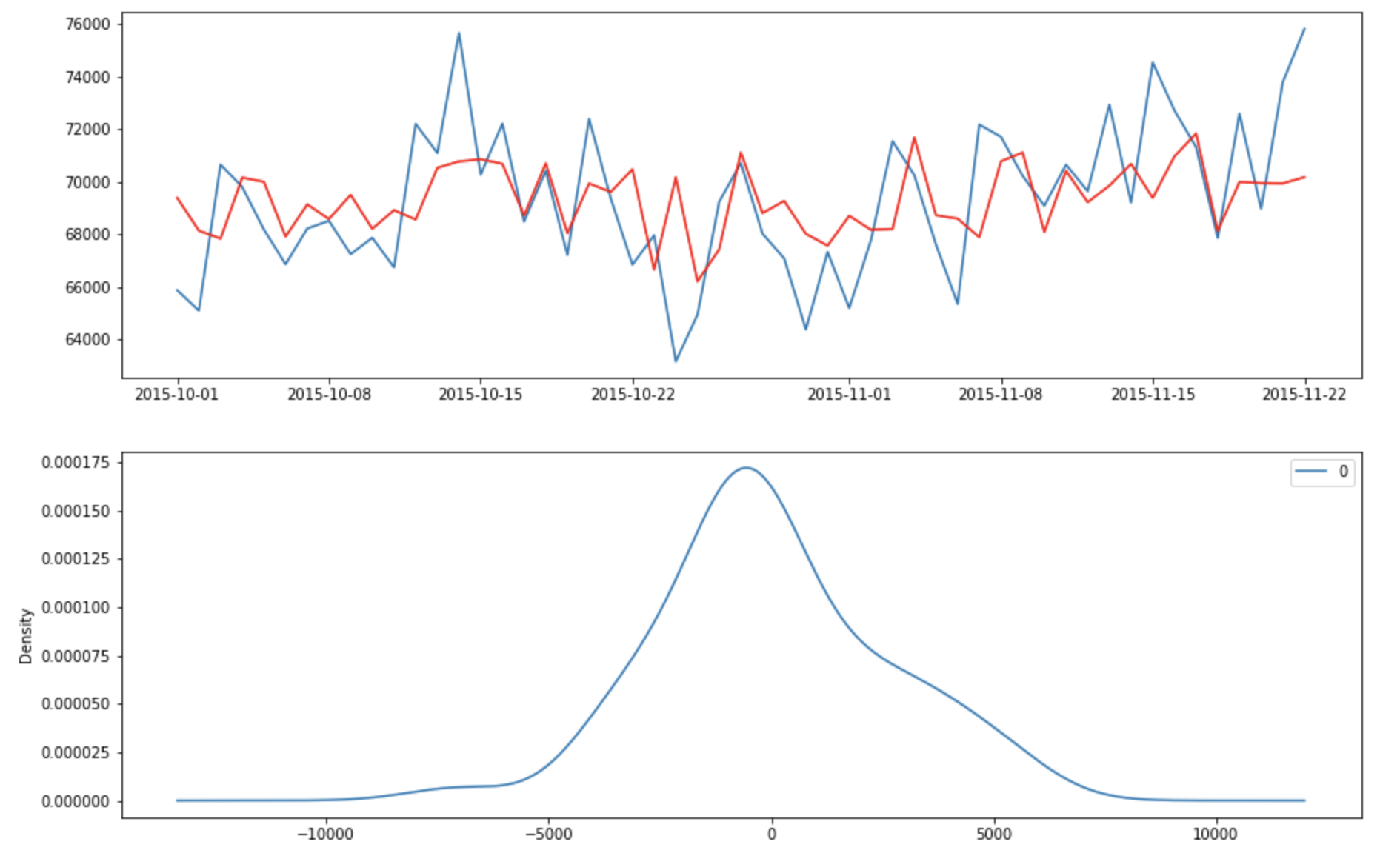
The errors appear to have zero means and follows a gussian distribution
Grid search for optimal p, q term
def grid_search_arima(data):
    mat_aic = np.zeros((5,5))
    for p in range(1,6):
        for q in range(1,6):
            try:
                #build model for each p,q
                model = ARIMA(data,order=(p,0,q))
                results_ARMA = model.fit(disp=0)
                #fill mat_aic with corresponding p,q
                mat_aic[p-1][q-1] = results_ARMA.aic
            except:
                print('not invertible')

    min_i, min_j = None, None
    min_aic = float('inf')
    #find the index of minimum aic score in mat_aic
    for i in range(mat_aic.shape[0]):
        for j in range(mat_aic.shape[1]):
            if mat_aic[i][j] < min_aic and mat_aic[i][j] != 0:
                min_aic = mat_aic[i][j]
                min_i, min_j = i,j
    return min_i + 1, min_j + 1
The optimal p, q term are 1, 2 and the evaluation metric i use in this case is AIC metrics, which is a popular metric to measure the fitness of the model. Lower the value means the better the fit.
Forecasting
def forcaset_each_group(df):
    ad_group_dict = {}
    for i in range(1,41):
        #extract date and shown for each ad_group
        ad_group = df[df['ad']=='ad_group_'+str(i)][['date','shown']]
        #set date as index
        ad_group.index = ad_group.date
        #drop date column
        ad_group = ad_group.drop('date',axis=1)
        # grid search the best p, q for each ARIMA model
        p,q = grid_search_arima(ad_group['shown'])
        #finalize the ARIMA model
        final_ARMA = ARIMA(ad_group['shown'],order=(p,0,q)).fit(disp=0)
        #forecast the next three values
        forecast, _, _ = final_ARMA.forecast(steps=3,alpha=0.05)
        #backtest the final ARMA model
        split_rmse = backtest_model(ad_group['shown'],final_ARMA,3)
        #average rmse over three fold
        avg_rmse = sum(split_rmse)/len(split_rmse)
        #append rmse at the end of forecast
        result = np.append(forecast,avg_rmse)
        #append result into each group
        ad_group_dict['ad_group'+str(i)] = result
    return ad_group_dict
The prediction of number of ads shown on December 15th
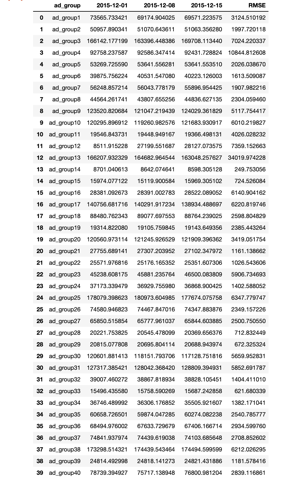
The above table shows that the RMSE is approximately 5% of our prediction value. The standard deviation of the data set is approximately the same as the RMSE which shows that this is a good prediction model.
Challenge3
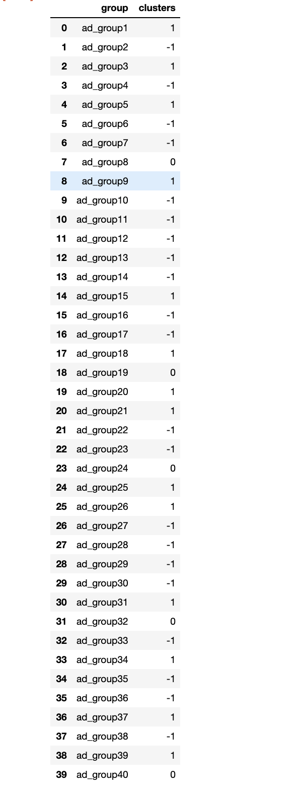
In order to cluster ads into three different group by the trend of the average cost per click, I fit a linear model with time as independent variable and average cost per click as dependent variable for each ad group. If the p-value of coefficient of time is non significant, then we consider the there is no trend in average cost per click (0). if the p-value of coefficient is significant and the coefficient is positive, then positive trend (1). if the coefficient is negative, then negative trend(-1).
def parse_ad_groups(df):
    ad_group_dict = {}
    for i in range(1,41):
        #extract only date and avg_cost_per_click columns
        ad_group = df[df['ad']=='ad_group_'+str(i)][['date','avg_cost_per_click']]
        #convert date to integer
        ad_group['t'] = [i for i in range(1,len(ad_group)+1)]
        #build linear regression model
        model = smf.ols(formula='avg_cost_per_click ~ t',data=ad_group).fit()
        #check the pvalue, if not significant
        if model.pvalues.t < 0.05:
            ad_group_dict['ad_group'+str(i)] = 0
        else:
            #if the coefficient is positive
            if model.params.t > 0:
                ad_group_dict['ad_group'+str(i)] = 1
            #if the coefficient is negative
            else:
                ad_group_dict['ad_group'+str(i)] = -1
    return ad_group_dict
Further Improvement
- try different model (vector auto regression) to predict the number of impression
- try k-means clustering to predict the trend of the group
- evaluate the model with different metrics such as Root mean percent error, min max ratio.
if you are interested in detail explaination of time series model. you can visit my other blog
