Introduction
the objective of this blog is to demostrate three informative visualization about Malaria from the dataset
I mainly focus on two datasets:
- Malaria_death_age.csv which describe number of Malaria deaths incidence from 1990 until 2016 over 200 countries across different age groups
- Malaria_death.csv which describe Malaria deaths by over 200 countries for all ages across the world and over time
Visualization 1
First, I would like to understand which age group has the highest number of malaria death from 1990 to 2016.
fig, ax = plt.subplots(figsize=(15,10))
sns.lineplot(x='year',y='deaths',hue='age_group',data=malaria_death_age,ax=ax)
ax.set_title('malaria death by age group')
fig.savefig('age.png')
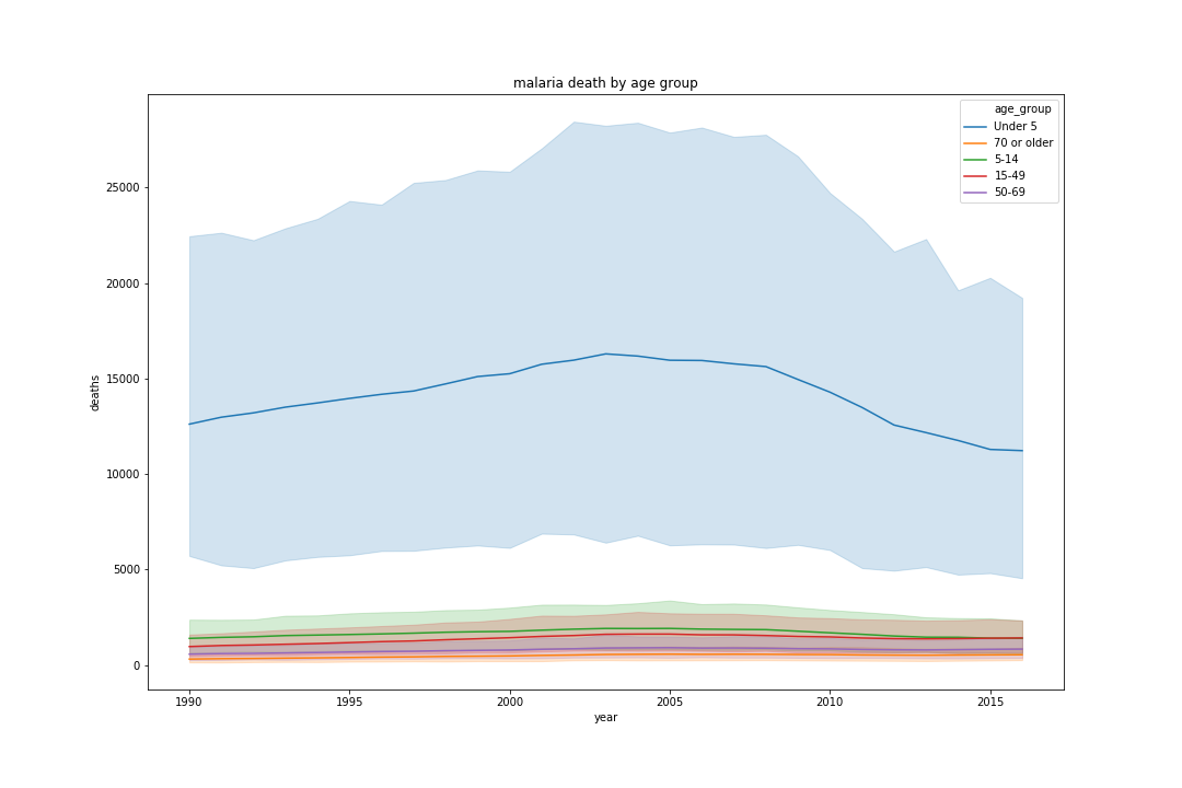
From the above graph, I can conclude that babies (ages under 5) have the highest number of the deaths over 26 years.
Visualization 2
Second, I would like to understand which continent has the highest death Rate from 1990 to 2016. Since there are no continent columns. I find a csv file that contains all the country around the world and its corresponding continent. I then merge the table with malaria death table as following

I then plot the death rate by each region from 1990 until 2016.
fig,ax = plt.subplots(figsize=(20,15))
sns.lineplot(x='Year',y='Rate',hue='region',data=malaria_death,ax=ax)
ax.set_title('malaria death rate each year by region')
fig.savefig('region.png')
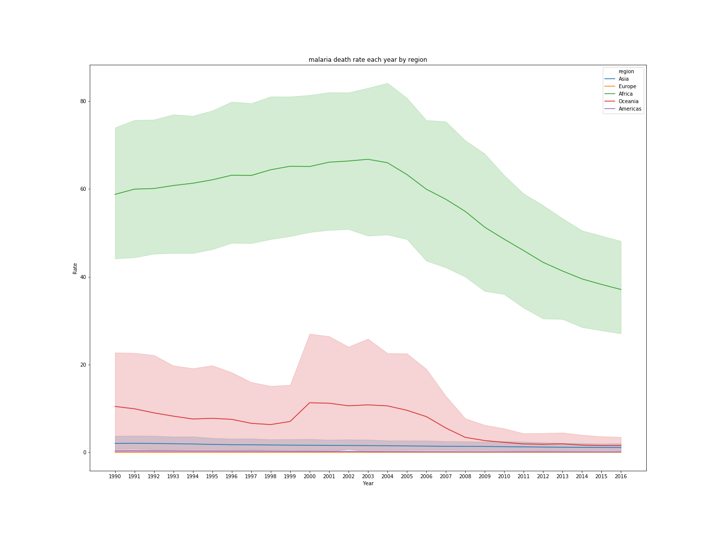
From the above graph, I can conclude that Africa has the highest death rate from 1990 until 2016.
Visualization 3
Last, I would like to predict the trend of the country that has the highest death rate from 2017 until 2021.
I first need to find out the country that has the highest death rate over the past 20 years.
idx = malaria_death[['Entity','Year','Rate']].groupby(['Year'])['Rate'].transform(max) == malaria_death['Rate']
malaria_death[idx].sort_values('Year')['Entity']
after running the above code, Burkina Faso has the highest death rate since 2010. Thus, I would like to predict its death rate from 2017 until 2021. I plot the death rate of Burkina Faso from 1990 until 2016.
df = malaria_death[malaria_death['Entity'] == 'Burkina Faso'][['Year','Rate']]
df.Year=pd.to_datetime(df.Year,format='%Y')
df.Rate = df.Rate.astype('float')
fig,ax = plt.subplots(figsize=(10,8))
df.plot.line(x='Year',y='Rate',ax=ax)
ax.set_xlabel('year')
ax.set_ylabel('Rate')
ax.set_title('Burkina Faso death rate over 20 year')
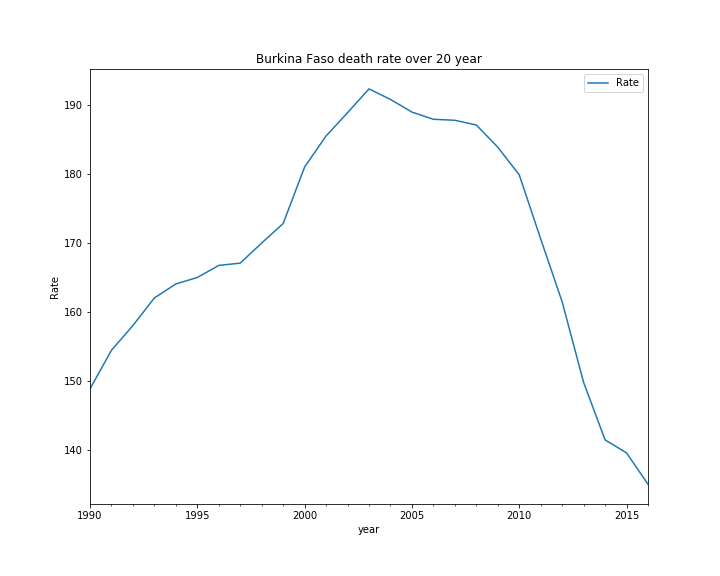
The death rate over the years does not appear to be stationary. I would like to test the stationarity of the death rate
def test_stationarity(timeseries):
    '''plot the rolling mean vs rolling standard deviation vs original timseries
       test stationarity of a timeseries with dicky fuller test

    Parameters
    ----------
    timesereis: pandas.Series

    returns
    -------
    None

    '''
    #determine rolling statistics, make sure the time series is not white noise
    rolmean = timeseries.rolling(3).mean()
    rolstd = timeseries.rolling(3).std()
    #plot rolling statistics
    fig , ax = plt.subplots(figsize = (10,8))
    original = ax.plot(timeseries,color='blue',label='original')
    mean = ax.plot(rolmean,color='red',label='rolling_mean')
    std = ax.plot(rolstd,color='black',label='rolling_std')
    ax.legend(loc='best')
    ax.set_title('original vs rolling_mean vs rolling_std')
    plt.savefig('original_vs_rolling_mean_vs_rolling_std')

    #perform dicky-fuller test:
    print("perform dicky fuller test: ")
    dftest = adfuller(timeseries,autolag='AIC')

    dfoutput = pd.Series(dftest[0:4], index=['Test Statistic','p-value','#Lags Used','Number of Observations Used'])
    for key,value in dftest[4].items():
        dfoutput['Critical Value (%s)'%key] = value
    print(dfoutput)
The dicky fuller test statistics shows that the test statistic is 0.055 > 0.05. We can’t reject the null hypothesis. the data does not have a unit root and is not stationary.
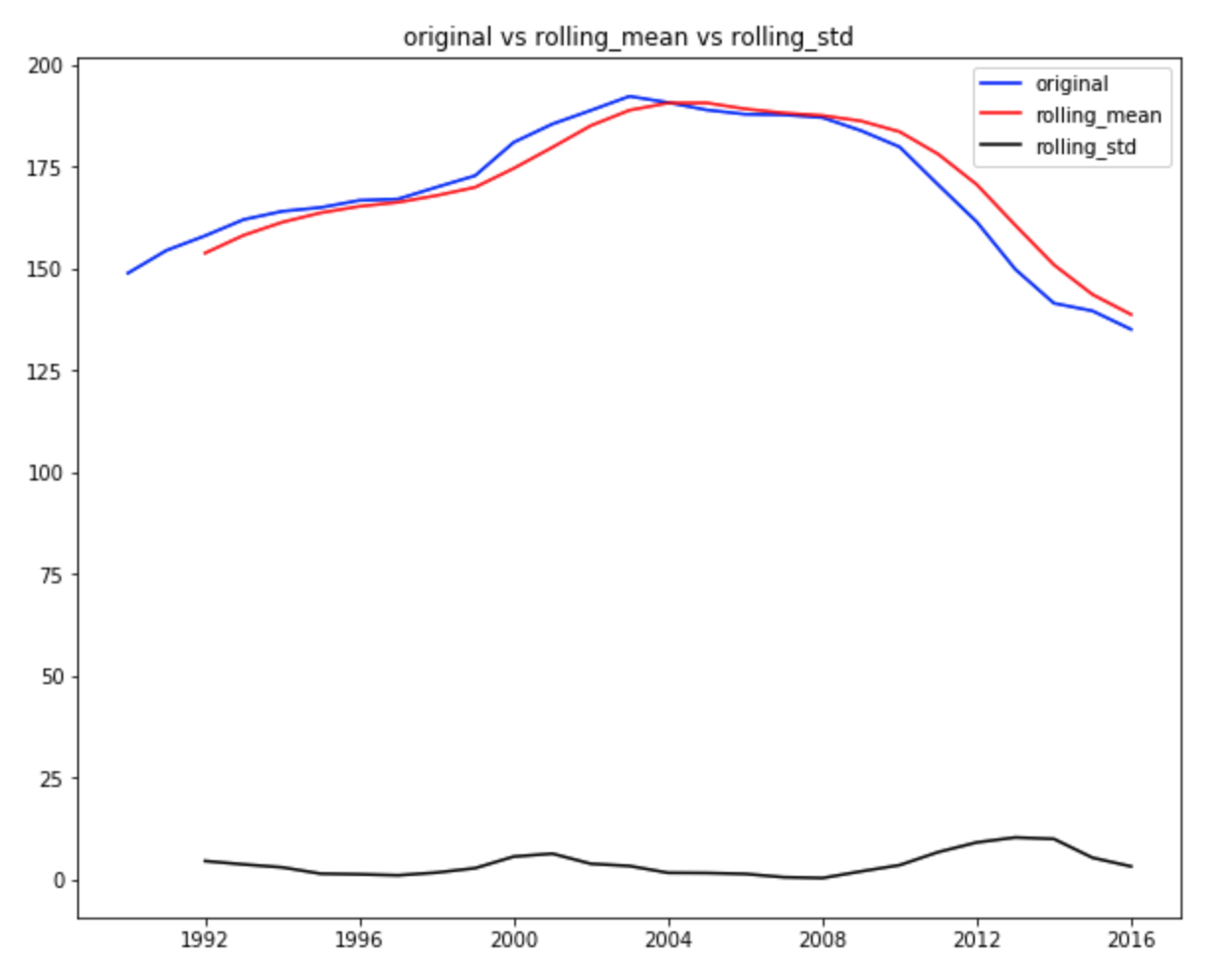
from the above graph, the standard deviation is relatively constant and there appears to have serrial correlation at different timestamps and the rolling mean is not 0. Thus, the timeseries is not a white noise.
Determine the p,d,q term for ARIMA model
d term
i decide to use the ndiffs from the utils to determine the differencing term parameter
from pmdarima.arima.utils import ndiffs
y = df.values
ndiffs(y, test='adf')
the result shows that d = 2.
p term and q term
I use the ACF and PACF plot to determine the auto regression lags and moving average lags.
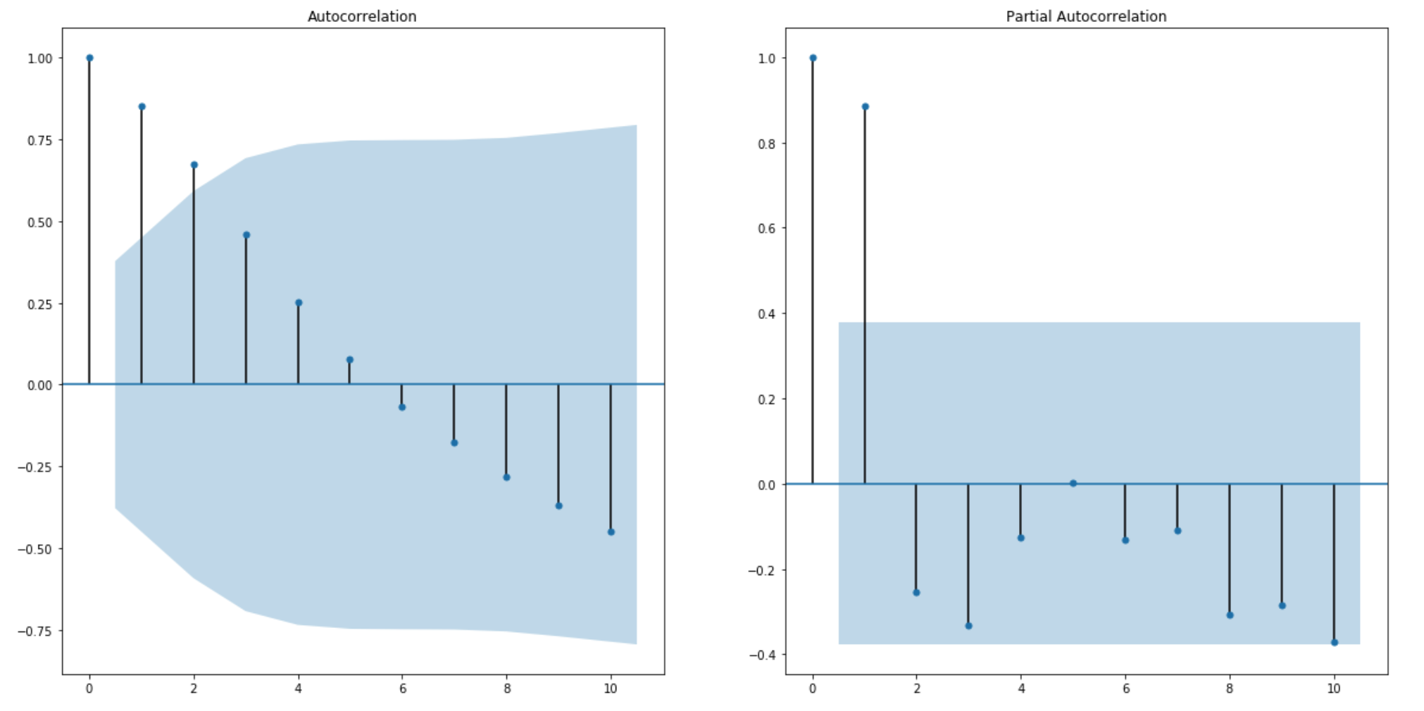
from the graph, a good starting point for p and q term is 2.
build ARIMA model
model = ARIMA(df['Rate'],order=(2,2,2))
ARIMA = model.fit(disp=0)
fig, axes = plt.subplots(2,1,figsize=(15,10))
axes[0].plot(df,label='original')
axes[0].plot(ARIMA.fittedvalues, color='red',label='fitted_value')
axes[0].legend()
residuals = pd.DataFrame(ARIMA.resid)
residuals.plot(kind='kde',ax=axes[1])
I also plot the original data vs the fitted value and I have also plot the kernal density plot of the residual.
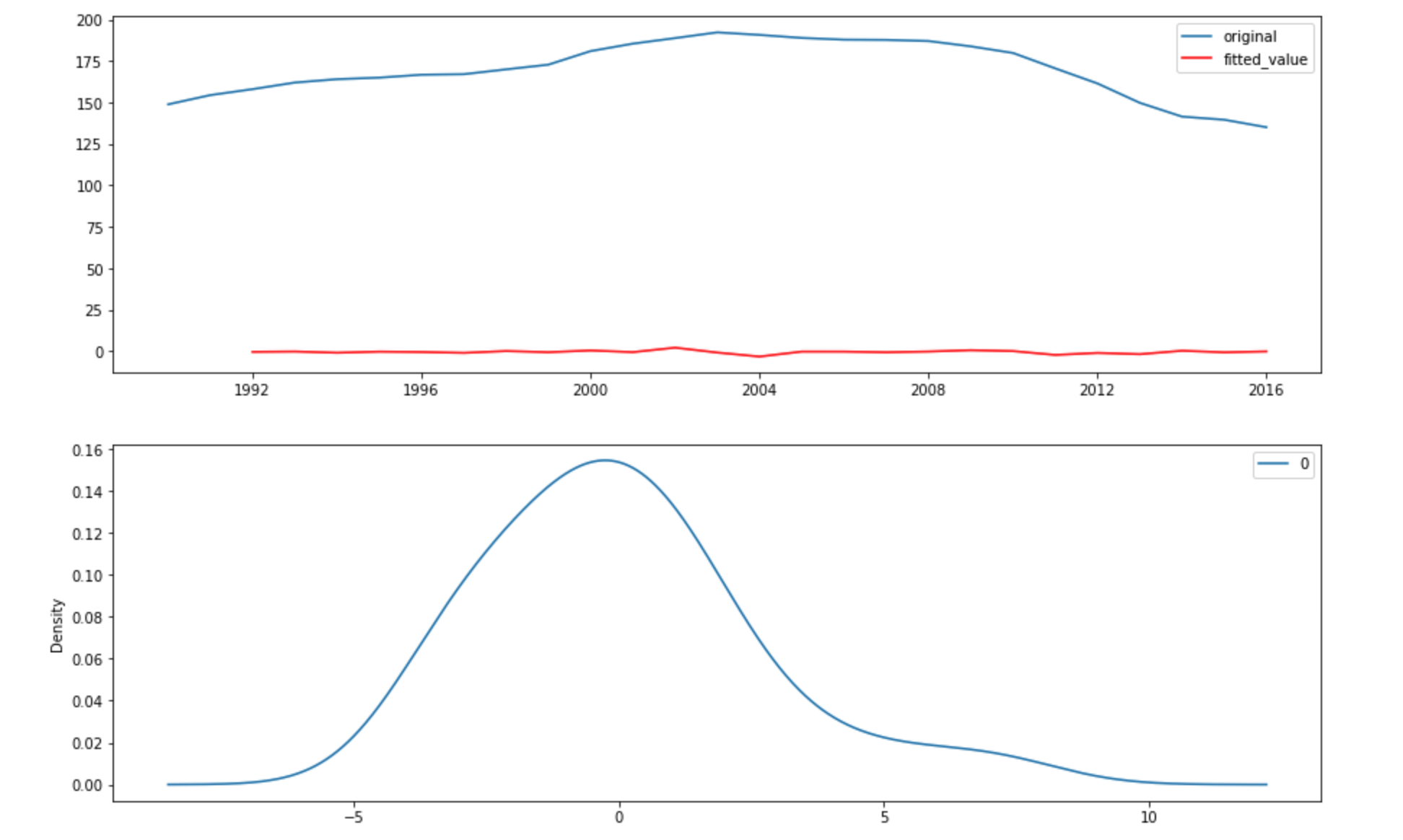
The above plot shows that the ARIMA model does not have a great fit but the residual appears to be normal and centered at 0 which indicates that there are no more information that can be learned with ARIMA model.
predict the death rate with ARIMA model
import datetime
predict_series = {}
prediction,_,_ = ARIMA.forecast(steps=5)
for i in range(2017,2021):
    predict_series[datetime.datetime.strptime(str(i),'%Y')] = prediction[i-2017]
#prediction from 2017 to 2021
predict_df = pd.DataFrame(predict_series.items(),columns=['Year','Rate'])
predict_df.index = predict_df.Year
predict_df.drop('Year',axis=1,inplace=True)
#plot the prediction vs original
fig, ax = plt.subplots(figsize=(15,10))
ax.plot(df,label='original')
ax.plot(predict_df,label='prediction')
ax.set_xlabel('year')
ax.set_ylabel('deaths')
ax.legend()
ax.set_title('Burkina Faso death rate prediction vs original')
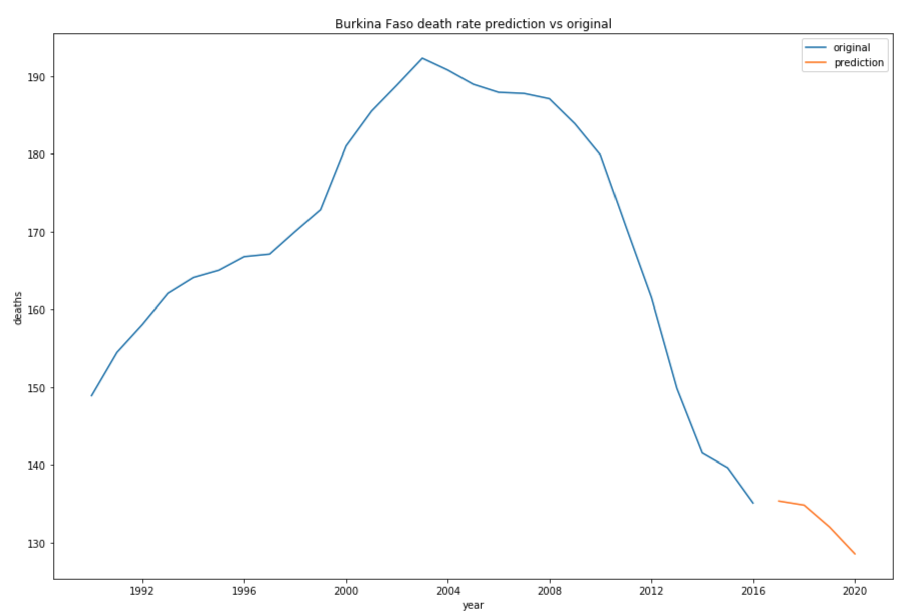
The above plot shows that the number of Malaria death in Burkina Faso will continue to decrease since 2016.
You can find my code here. You can also find more details about time series here