The objective of this blog is to explore the Phd datase. We would like to build a data dashboard via streamlit package.
Dataset
Data presented in Doctorate Recipients from U.S. Universities: 2017 were collected by the Survey of Earned Doctorates (SED). The Survey collects data on the number and characteristics of individuals receiving research doctoral degrees from U.S. There are total 72 tables within the dataset. Let’s talk about streamlit package.
Streamlit
Streamlit is an open source app framework specifically designed for ML engineers working with Python. It allows you to create a stunning looking application with only a few lines of code.A few of the advantages of using Streamlit tools like Dash and Flask:
- It embraces Python scripting; No HTML knowledge is needed!
- Less code is needed to create a beautiful application
- No callbacks are needed since widgets are treated as variables
- Data caching simplifies and speeds up computation pipelines.
Installation
In order to install the streamlit package. We can use the following command in Mac terminal:
pip install streamlit
we can open the terminal with following command
streamlit hello
Dashboard
we first import all the neccesary package to perform data analysis
import streamlit as st
import pandas as pd
import numpy as np
import plotly.express as px
from plotly.subplots import make_subplots
import plotly.graph_objects as go
import matplotlib.pyplot as plt
from plotly import tools
import plotly.offline as py
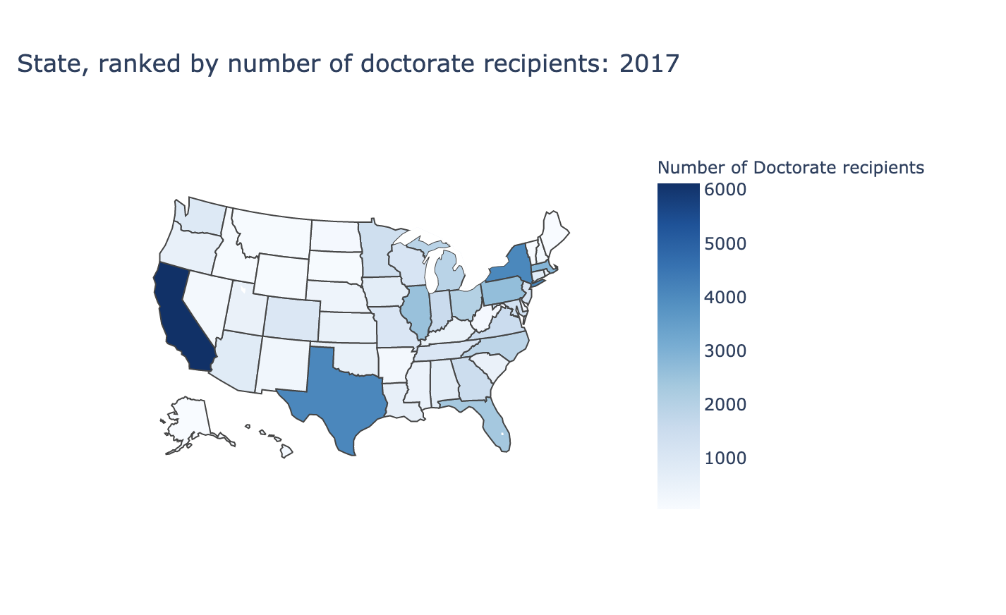
then, let me introduce some basic features that you are likely to be using in your own apps. We will first read in the “sed17-sr-tab005” excel file and display a colormap with following code
df = pd.read_excel('data_tables/sed17-sr-tab005.xlsx')
df = df[2:]
df.columns = df.iloc[0]
df = df.drop(df.index[0])
df_ = pd.read_csv('https://raw.githubusercontent.com/plotly/datasets/master/2011_us_ag_exports.csv')
df_code = df_[['code','state']]
result = pd.merge(df, df_code, how='inner', left_on='State or location', right_on='state')

if st.checkbox('Show Dataframe--Number of Doctorate recipients by States'):
    st.write(result)

fig = go.Figure(data=go.Choropleth(
    locations=result['code'], # Spatial coordinates
    z = result['Doctorate recipients'].astype(float), # Data to be color-coded
    locationmode = 'USA-states', # set of locations match entries in `locations`
    colorscale = 'blues',
    colorbar_title = "Number of Doctorate recipients",
))

fig.update_layout(
    title_text = 'State, ranked by number of doctorate recipients: 2017',
    geo_scope='usa', # limite map scope to USA
)

st.plotly_chart(fig)

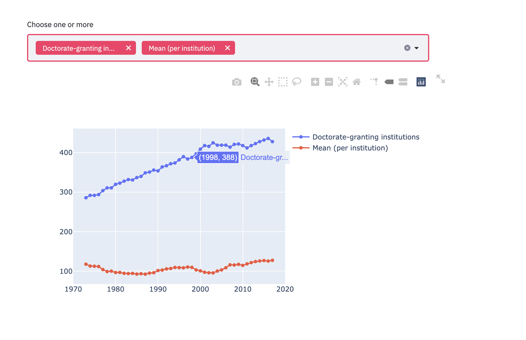
we would then display a multiselect box with “sed17-sr-tab006” excel file.
df_6 = pd.read_excel('data_tables/sed17-sr-tab006.xlsx')
df_6 = df_6.iloc[2:5,1:]
subjects = df_6.iloc[0].dropna().to_list()
df_male = df_6.iloc[2].to_list()[::2]
df_female = df_6.iloc[2].to_list()[1::2]
df_6 = pd.DataFrame({'Male': df_male,
                  'Female': df_female},
                  index=subjects)

sex = ['Male','Female']


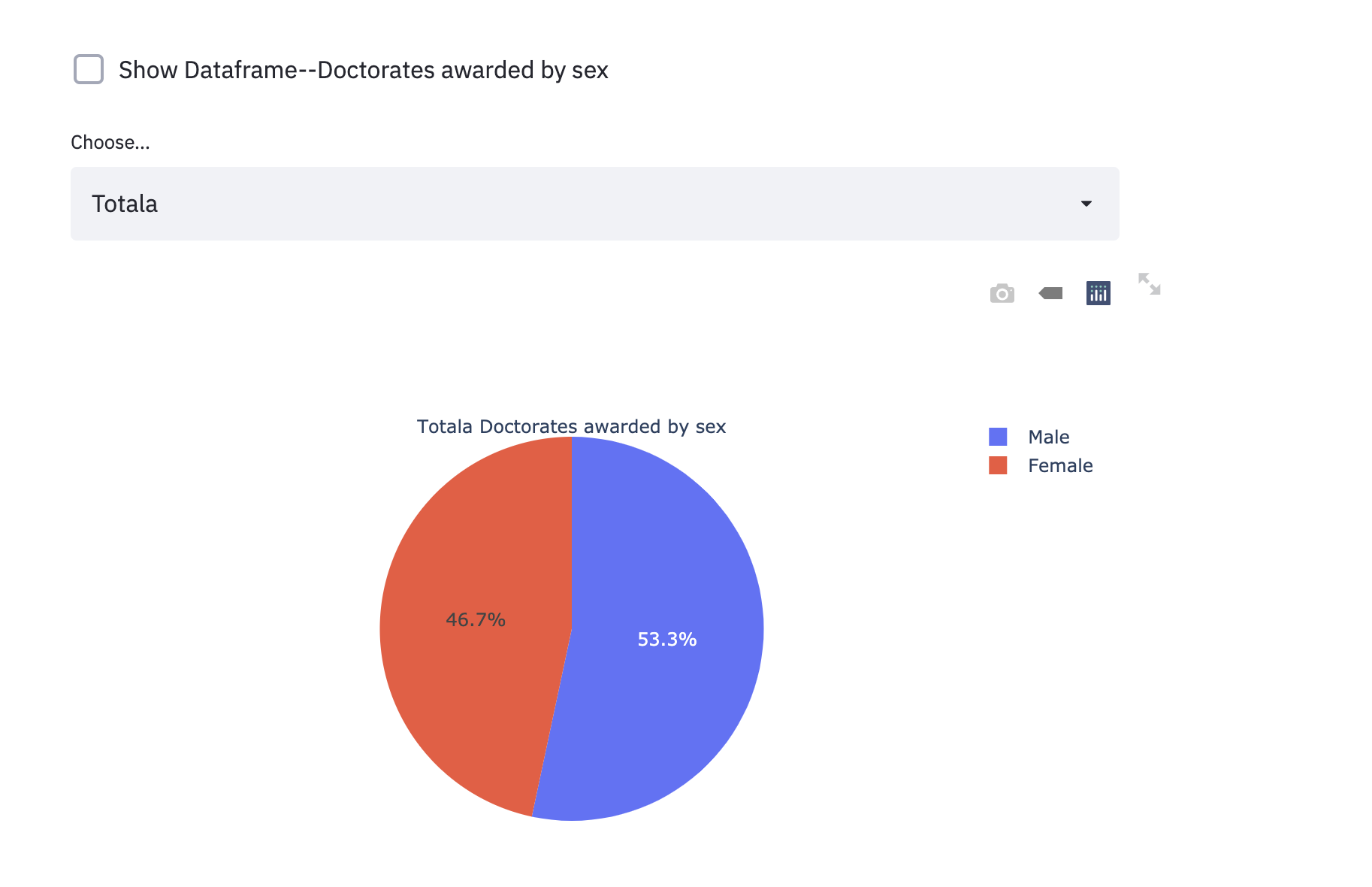
if st.checkbox('Show Dataframe--Doctorates awarded by sex'):
    st.write(df_6)

selected_metrics_2 = st.selectbox(
    label="Choose...", options=subjects
)

fig = go.Figure()
for i in subjects:
    if selected_metrics_2 == i:
        fig = go.Figure(data=[go.Pie(labels=sex, values=df_6.loc[i],title= i+' Doctorates awarded by sex')])


st.plotly_chart(fig, use_container_width=True)


subset_data = df_2
country_name_input = st.multiselect('Choose one or more', df_2.columns[1:])
# by country name
if len(country_name_input) > 0:
    subset_data = df_2[country_name_input]

fig = go.Figure()
for i in subset_data.columns:
        fig.add_trace(go.Scatter(x=df_2.Year, y=df_2[i],
                        mode='lines+markers',
                        name=i))

st.plotly_chart(fig, use_container_width=True)

Lastly, we would like to display a piechart for “sed17-sr-tab002” file to display the portion of Doctorate-granting by sex
df_2 = pd.read_excel('data_tables/sed17-sr-tab002.xlsx')
df_2 = df_2.iloc[4:,:]
df_2.columns = ['Year','Doctorate-granting institutions','Total','Mean (per institution)','Median (per institution)']
#df_2 = pd.read_csv('')
if st.checkbox('Show Dataframe--Number of Doctorate recipients by Institutions'):
    st.write(df_2)

selected_metrics = st.selectbox(
    label="Choose...", options=['Doctorate-granting institutions','Total','Mean (per institution)','Median (per institution)']
)


fig = go.Figure()
if selected_metrics == 'Doctorate-granting institutions':
    fig.add_trace(go.Scatter(x=df_2.Year, y=df_2['Doctorate-granting institutions'],
                    mode='lines+markers',
                    name='Doctorate-granting institutions'))
if selected_metrics == 'Total':
    fig.add_trace(go.Scatter(x=df_2.Year, y=df_2.Total,
                        mode='lines+markers', name='Total'))
if selected_metrics == 'Mean (per institution)':
    fig.add_trace(go.Scatter(x=df_2.Year, y=df_2['Mean (per institution)'],
                        mode='lines+markers',
                        name='Mean (per institution)'))

if selected_metrics == 'Median (per institution)':
    fig.add_trace(go.Scatter(x=df_2.Year, y=df_2['Median (per institution)'],
                        mode='lines+markers',
                        name='Median (per institution)'))
st.plotly_chart(fig, use_container_width=True)

Run the dashboard
in order to run the above application, we will go to the directory where your .py file is stored and run the following command
streamlit run {filename}
The above precedure is required to successfully build a streamlit dashboard.